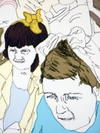
Some of my development work from a week or two ago- i think the images work pretty well. A really quick way to produce good simple images.
Wednesday, 19 May 2010
Stuff. Stuff. Stuff.
So me and the sewing machine have become buddies... kind of. I started on my epic battle to make 15 embroidered pictures for my book. The first one was almost quite a narrative image, however I wanted to leave sections of it 'unfinished' as it looked more affective like this and it ties through with the idea of these people being missing. I also half way through the sewing decided to leave the threads loose as an experiment to see how it looked and I think it worked well so I took this further in the other images. A friend made a comment that he thought the image looked better on the reverse side of the fabric and when I asked another person's opinion they agreed and also mentioned there were not sure how affective the coloured fabric was. So with this in mind I moved onto some other images, always turning the fabric over to see the reverse affect. I also altered the needle thread tension in places, which is what produced the loop affect in the thread on the bottom image, though it is not that clear on here. I was really pleased with how they came out and I think leaving the images partially 'incomplete' worked well- making the images slightly ambiguous but also still conveying basic shape and form.


However, I am now feeling a bit hesitant about the idea of a book, as I think the images might work better on just one huge piece of fabric, which would be hung, then the loose threads will fall naturally. Also using intertwining images would be another advantage of one big piece of fabric. I also need to consider different coloured threads and if that may add interest to the images... I need to quickly sketch out some ideas in terms of layout and how this may work and a very mini version to see if this would work on the sewing machine. I'm also really conscious that time is running out now, so whatever decision I make, I need to make it in the next day.... I think I need to take advantage of the last tutored day tommorow to get some feedback.
Saturday, 15 May 2010
Thursday, 13 May 2010
Another Change in Direction
Over the past few days my ideas have changed a lot and although I am still doing essentially what I planned to do at the start, my final outcome is taking a slightly different shape. I had quite a few ideas... one was to produce a quilt, almost a homage to the missing people in my family. However, I felt this was too big a project and even with screen printing and combining quicker methods like cross stitch it would be unlikely I could produce something I was satisfied with. I screen printed the finished crowd image below but it was not particularly successful or best suited for printing so I don't think I will carry on that idea any further...

I did however produce some quick sketches from photographic material, where I was trying to mimic the movements and patterns of the sewing machine and I much preferred them.
Initially I was drawn to people like Jenny Hart. Though beautiful images, for my project these types of images are too time consuming and if I wanted to produce something of a slightly bigger scale, I would have to consider other methods of image making. Therefore a more sewing machine based image would be suitable and I experimented with that and I was pleased with how they came out. I also came across another illustrator, Gillian Bates on http://www.embroideryasart.com/ who's work is mainly machine based and she has given me a lot of ideas about composition and colour.
I then moved onto the idea of creating a space you could walk into and it would act as almost a giant photo album. I had the idea of producing embroidered images from my photographic material and framing it and hanging the pieces in the exhibition space on my own screen printed wall paper. I was going to make my own wall paper from memories I had of my grandparents house, taking patterns etc from fabrics and wallpaper in their home which I associated with them. Or I was going to screen print hand-drawn text containing stories, facts and information about the missing people. However after talking to Jen I have decided instead of producing a space which represents a photo album, I am actually just going to produce a giant photo album with about 20 embroidered images possibly with ink in caption, but I will probably leave that and decide if that is necessary when it is all put together. Before I start this I am going to quickly make a mock up book, to give me an idea of appropriate materials. So this is my new plan..... Jen also recommended I look up The Marvelous album of Madame B: being the Handiwork of a Victorian lady of Considerable Talent, which contains images which have been manipulated combining photography and hand drawn images. I had been wondering whether to combine photographic images, this may become too complicated, but whilst I was researching I stumbled across this website which is useful for anyone wanting to transfer images simply and cheaply.
So plan for next two weeks... WORK WORK WORK
- Experiment with transferring images to fabric and adding extra embroidery
- Finish worksheet of images to be used in the final book, considering colour and composition mainly
- Consider incorporating text- type face? How much? if any...
- Research old photo albums and how to bind my book together
- Quick experiment with cross stitch (using photoshop to create an image suitable for cross stitch)
- Find some old scrap wallpaper (possibly from portobello market) to use in exhibition
- MAKE THE BOOK AND PUT IT TOGETHER
- Consider how it will be showed in the exhibition
Friday, 7 May 2010
Slow Progress..
This is the drawing I was working on yesterday, I'm expecting it to double in size though but this is my progress so far... Even though the figures are fairly simplified it is still taking quite a while to draw out. I'm having to consider composition pretty carefully. It feels a little sterile at the moment but hopefully once I finish and add colour it will come to life a bit....

Looking back at a few drawings I made from life at the start of the project, I think I may be going off course with the drawing above.. it seems too rigid and I think that is because I am mainly working from photographic material. Even though this is a really quick sketch and a little bit awkward looking, I still think I prefer the looser style, so I may alter my plans a bit....
Monday, 3 May 2010
A few Aims for this week
- Produce an image to be screen printed to potentially form the patches of the quilt
- Consider fully composition and different methods of putting the quilt/final outcome together (maybe use work sheets for this...?)
- Start producing some cross-stitch images on photoshop and sew the patterns
I need to decide if I'm going to make a quilt in the fairly traditional form using patches with images on each and maybe a main image or whether I am going to manipulate the fabric to form one main image. For example like the work of Siggi Eggertson, which can almost be compared to a 'painting by numbers' technique. There are so many ways I could go with this quilt, I really need to pin point one main idea in terms of composition and stick to it.
Pick Me Up
Last thursday I went to Pick Me Up at Somerset house- the first contemporary graphic arts fair in the UK. The Work was by an international selection of graphic artists and illustrators who used a diverse range styles and techniques. It showcased Collaborations such as Peep Show , Nobrow Press and Nous Vous . I thought the work was fantastic and it was great seeing illustrators at work, for example Rob Ryan who had moved his studio into a room in somerset house for the duration of the exhibition. It was also really refreshing to go to a space and see purely graphics and illustration work being displayed.
I found the work really inspiring. I really liked Le Gun's work of which I can't remember the name of, but it was basically a giant plastic white bum (about 2m by 2m) and a hole was made between the bum cheeks and you looked through it and the wall behind it was covered in black and white illustrations. I thought it was a great way to present work and you kind of hand of walk from side to side so you could see all the drawings through the bum hole. Plus the fact there was a giant white bum attached to the wall was quite eye catching in iteself.... I was also drawn to Nicholas Burrow's work who is part of the collaboration Nous Vous. I like his simplified interpretation of figures and the slight awkwardness of them reminds me quite a lot of Luke Best's work. In my project I will be drawing many figures as the first step in my process, possibly in a crowd so his work was very relevant in that respect.

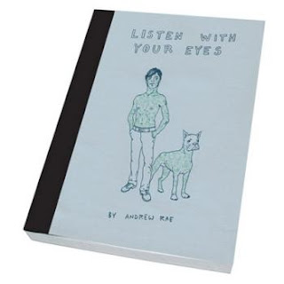
Andrew Rae's work was also very relevant in the way he builds up crowds of figures. His images have quite a clean cut, finished quality which I like and after looking up more of his work I was really impressed by how well he instantly characterizes people. I picked up his Postcard book at the fair. The image below made me think I might like to build up a similar crowd of people, working from old family photos and then possibly using screen printing onto fabric to produce the final image. From there I could then cut the fabric up into smaller squares to make up the patches for a quilt or the image itself could form the final outcome and I could possibly work back into it, embroidering certain sections.
Another find was Natsko Seki's work . She seems to combine photos of faces with hand drawn and printed imagery, which was extremely effective. In general I thought her work was really clever and executed perfectly with clearly a lot of thought put into composition. It has lead me to consider making my original photographs more prominent in my work as well as considering composition more as that is usually something I find quite difficult and her work made me realise how much it affects the quality of the work.
Subscribe to:
Comments (Atom)


